Ollie Onboarding Refresh

Background

Ollie is a dog food D2C subscription ecommerce company. Ollie needed to replatform the entirety of both their FE and BE code. There was quite a bit of tech debt and there were big changes coming our way, such as a rebrand and new subscription models to be sold.

Problem

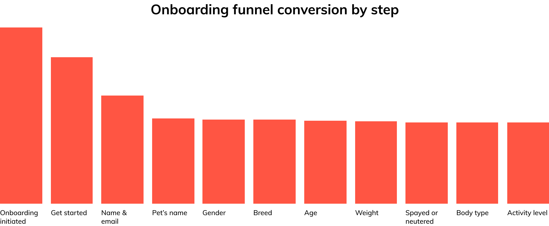
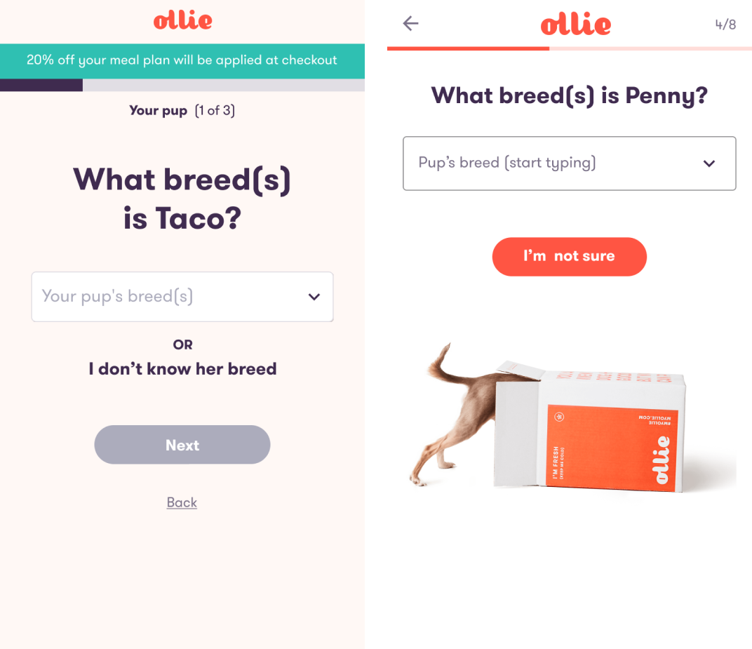
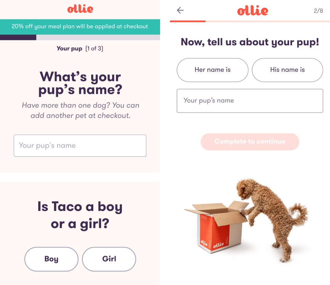
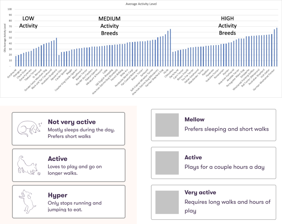
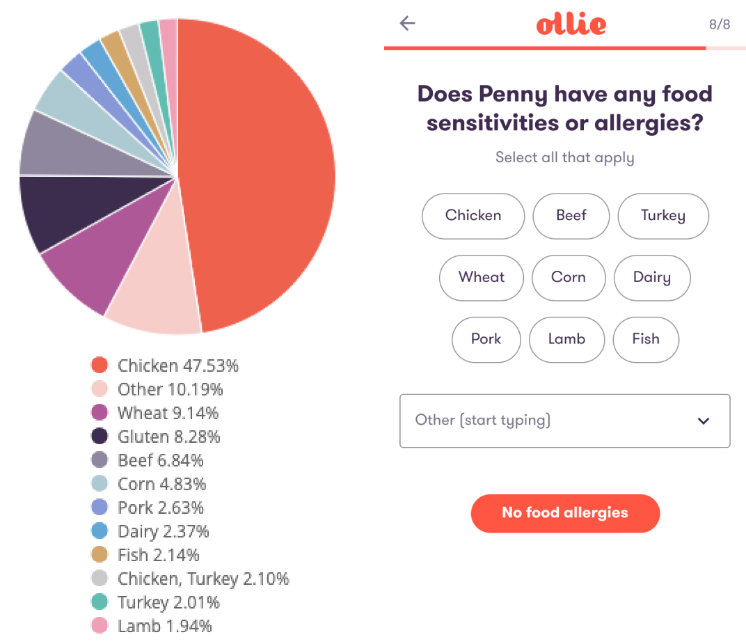
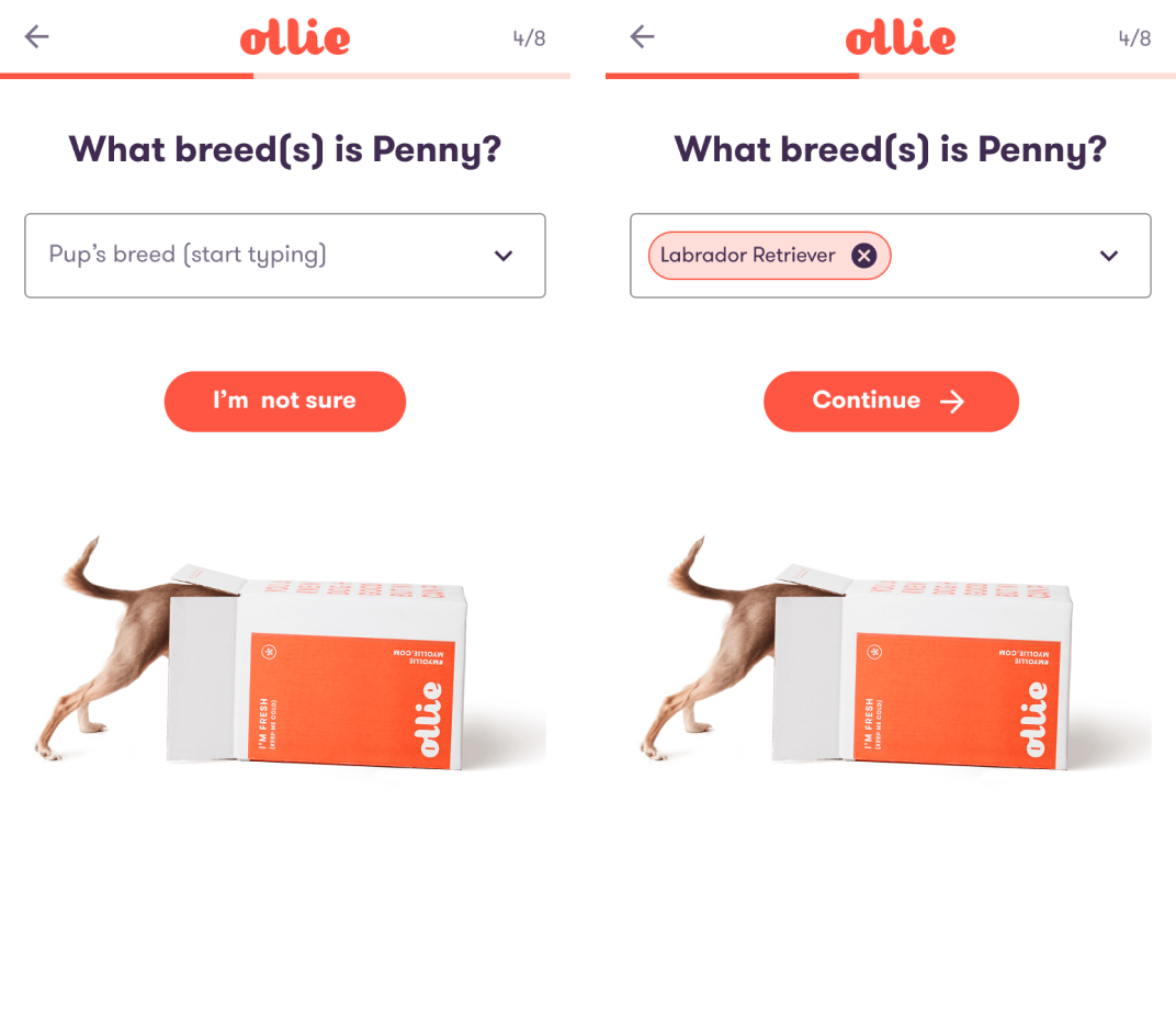
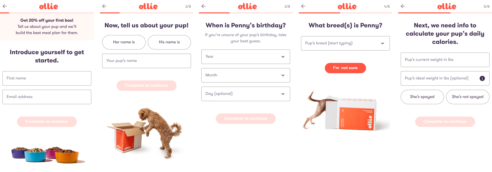
Technology’s plan was to replatform the FE starting at the beginning of the customer funnel. I had approximately 3 weeks to identify the current problems with the onboarding flow and do a “refresh” of the design.

Goal

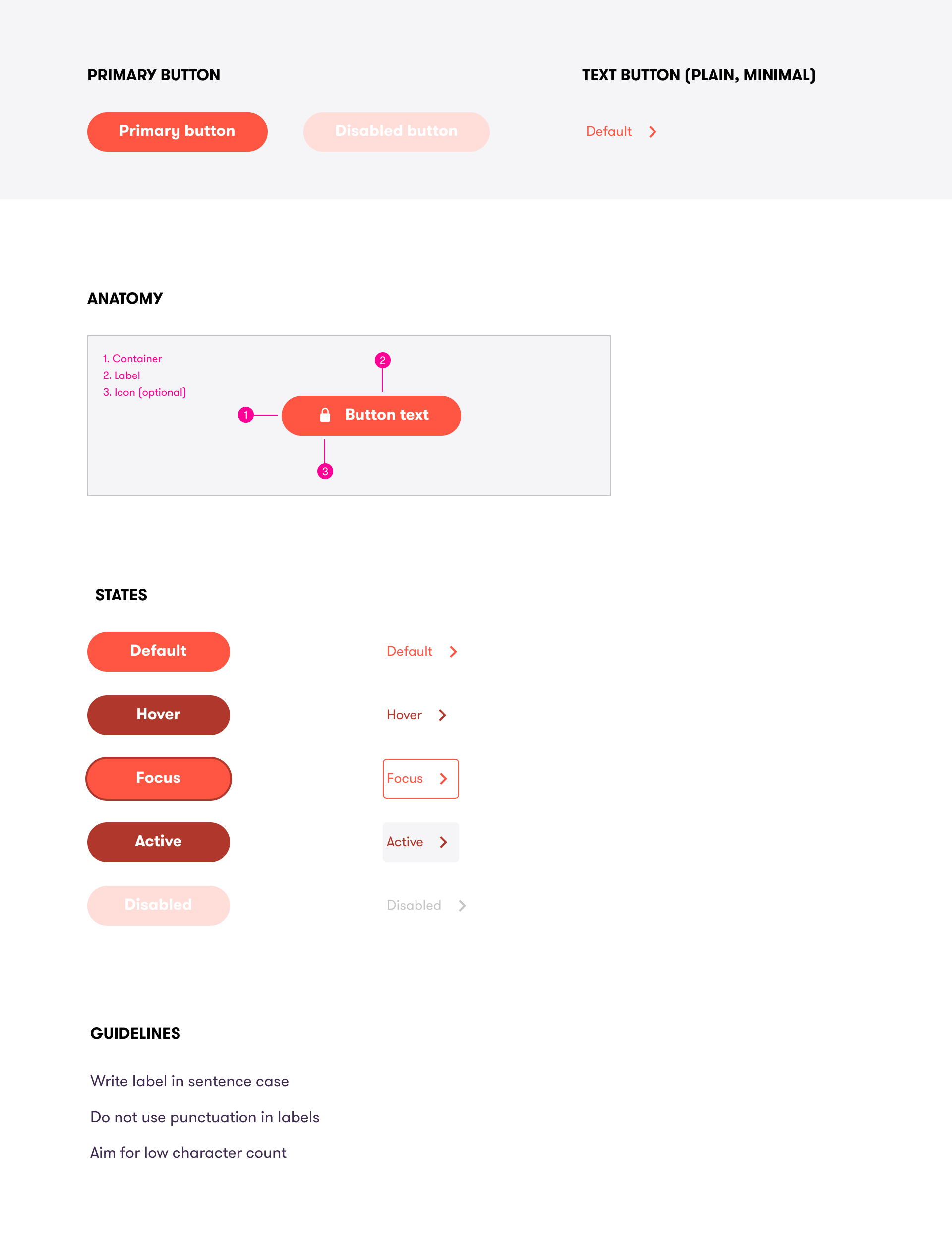
To build a new onboarding flow in React utilizing new design system foundations and components. UX improvements would increase current onboarding conversion (measured as initiated onboarding to plan page).

Team

My role was senior product designer. The rest of the team consisted of a product manager and 4 FE developers. Our key partners were marketing, CX, and strategy.

Supporting Data

I focused on onboarding funnel conversion data in order to learn where in the flow visitors were dropping off. This data was split a few different ways such as mobile vs desktop. I also looked into how many visitors drop off from onboarding and then return and complete onboarding at a later time.

Below shows overall onboarding funnel conversion step by step. The majority of drop off happens at the time of email collection.

User Research

Besides looking at available data, I also observed users interacting with the current onboarding flow experience. I paid close attention to any questions users seemed to get stuck on or weren’t comprehending, as well as how they interacted with the prototype. Participans had the oportunity to give open feedback at the end and were asked questions on how long they perceived the onboaarding flow to be.

Focus Areas

Synthesizing the data and user research, I defined the areas of improvement into different themes and began thinking through solutions to the main problems.

Marketing

Increased Context

Improved Interactions

Design System Components

The FE lead and I had been in discussions about desinging and developing a design system for Ollie. There were foundation styles I had been using in designs for a couple months and a FE intern had added them into Storybook. The replatfrom of onboarding provided the perfect reason to build out additional components that could be used throughout the experience.

Final Designs

Results

  1. After a week of going live conversion from onboarding to the next step (meal plan selection) increased by 10%.
  2. 9 new common components were designed and developed including a primary button, chip, input, select, progress indicator, and banner.
  3. The onboarding flow was decreased from 12–13 steps to 8 steps, getting visitors through the flow faster, without losing any critical information.

Reflection

This initiative was timeboxed to be 3 weeks for design work. If I had more time I may have looked into conducting competitive usability testing and/or explored alternative ways to gather information from from visitors outside of the quiz format.

Technology and product waited to discuss how we were going to tackle building the new onboarding, resulting in design having to scramble to get the details of the components together and ready for engineering to build.

In the month prior to this work, product had made the case of needing a usability testing tool to leadership. I would not have been able to move as quickly or with as much confidence if I didn't have a usability testing tool to utilize.