Flights was Priceline's first product, but had been neglected over the years. The Priceline Group made a decision to invest in a new Flights product team to make the online experience of booking a flight great again. With the growth of mobile, we focused first on the mobile web path. We then built up from mobile into a new responsive path.
{01} Learn
I collaborated with our product manager on competitive research and analytics data and conducted user research into a comprehensive report that allowed us to plan our requirements for the MVP. Some questions we initially came up with to answer included: who is the flights customer, how do people search for a flight, and how do people pan their trip?
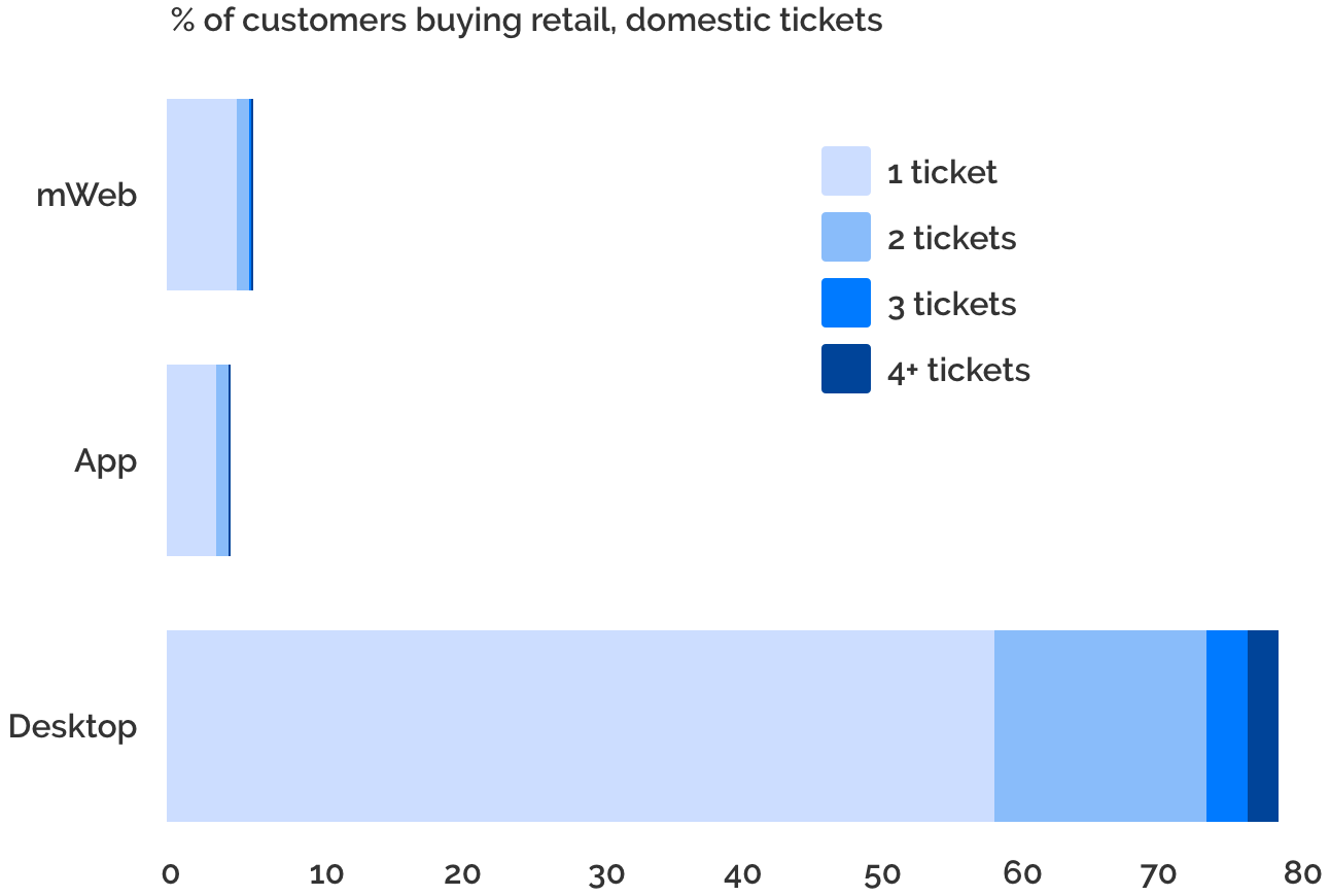
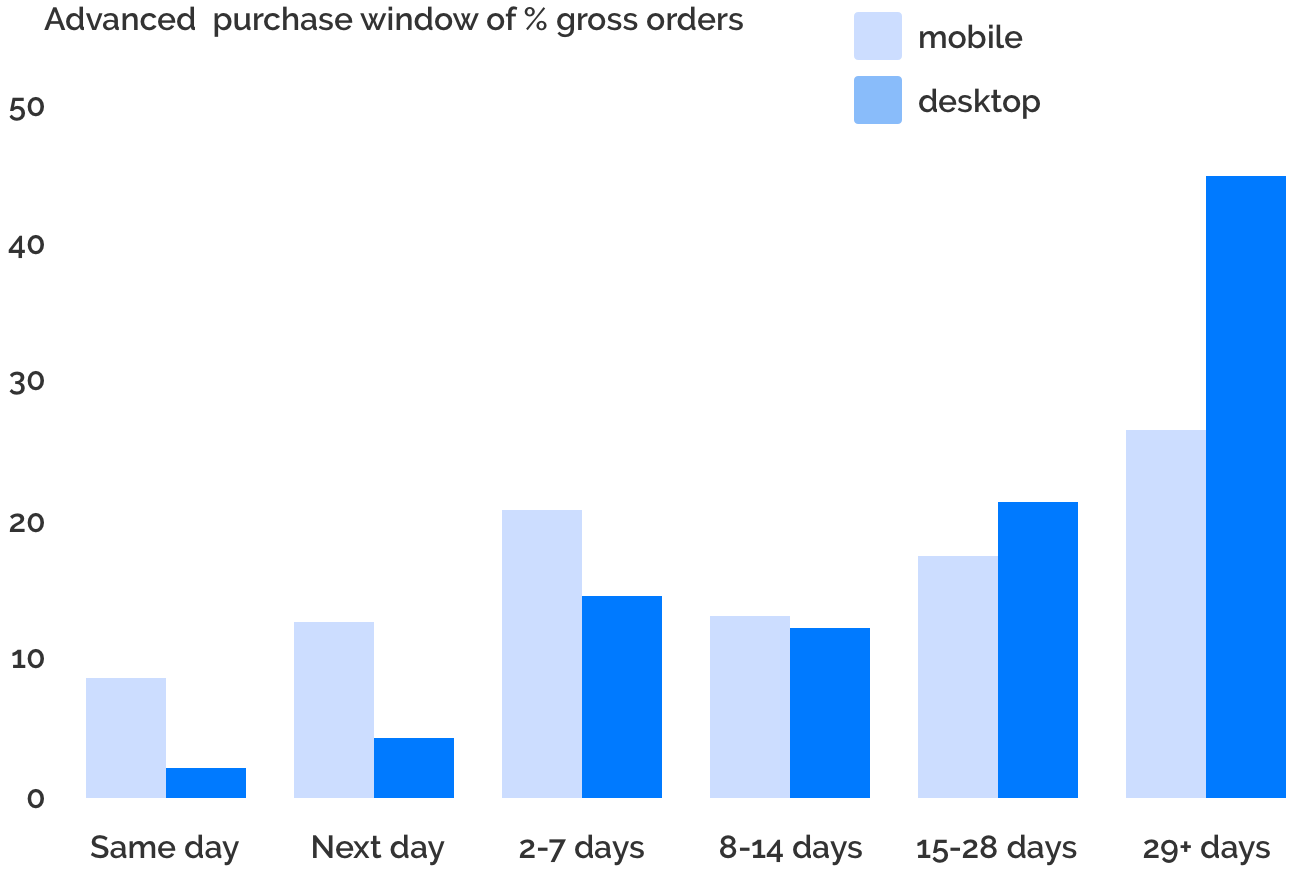
I was surprised by some of the data I pulled including the large amount of orders for just one ticket and the amount of customers booking the same day or 1 day in advance on mobile devices. These were a couple of important points I kept in mind when thinking of next steps.
{02} Strategy
The product and tech team got together to discuss the best way to build the new flights experience. We decided to entirely scrap the old flights website early on since the code was old and broken. Then, after talking about development and design implications of a single app vs multiple applications decided to split the site into three different applications. And though out of scope for the initial MVP, we tried to keep in mind that this could be built up to be responsive.
{03} Prototyping
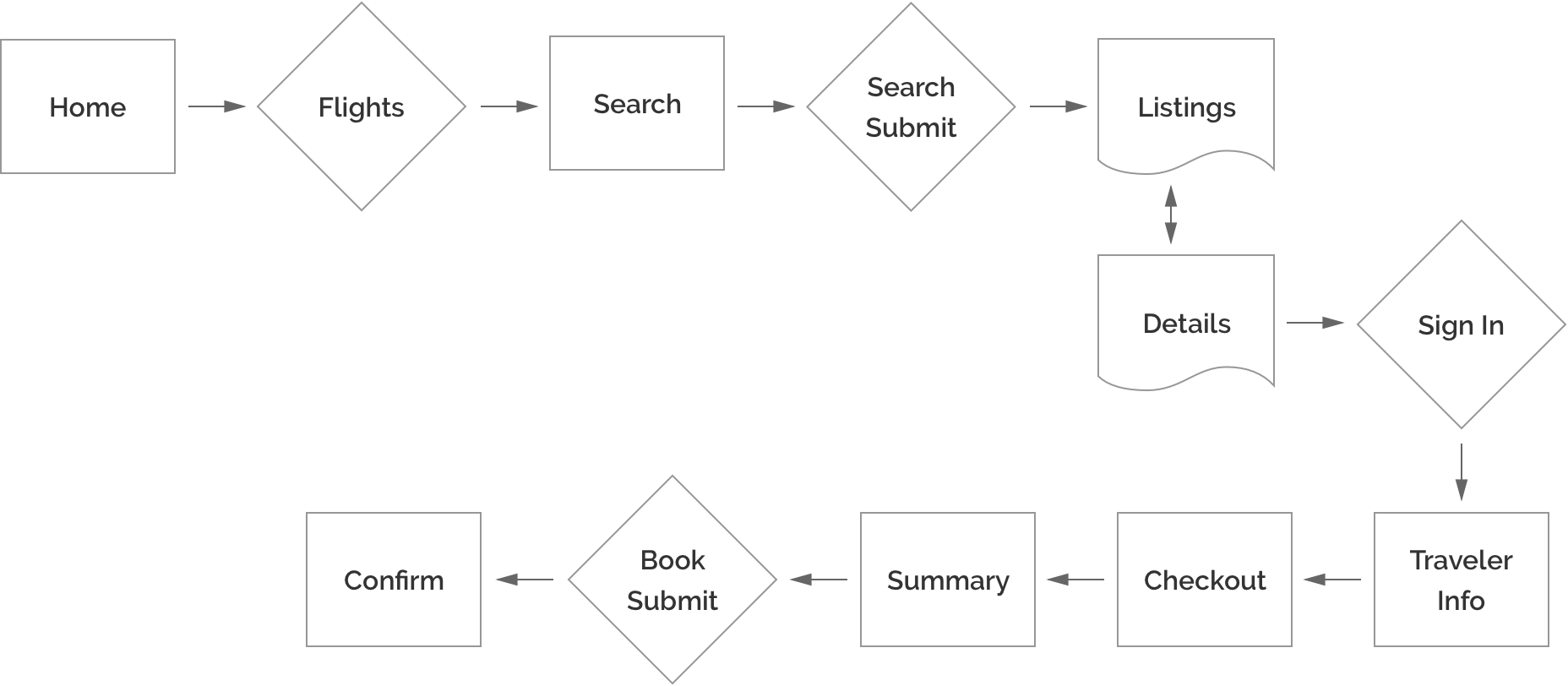
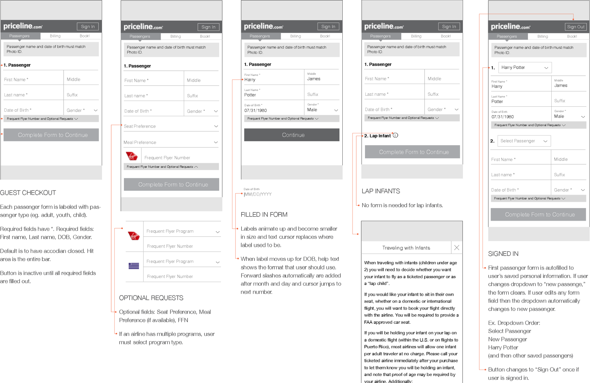
Because I was a single designer working with a large team of 7-9 developers, the devs started building from wireframes. I created prototypes from my wireframes as I began to work through the user flow and then created specs focusing on the functionality. As the developers built out the core functionality, I had time to finalize the visual designs and smaller interactions.
{04} Design
As the developers built out the core functionality, I had time to focus on and finalize the visual designs and smaller interactions of the path.
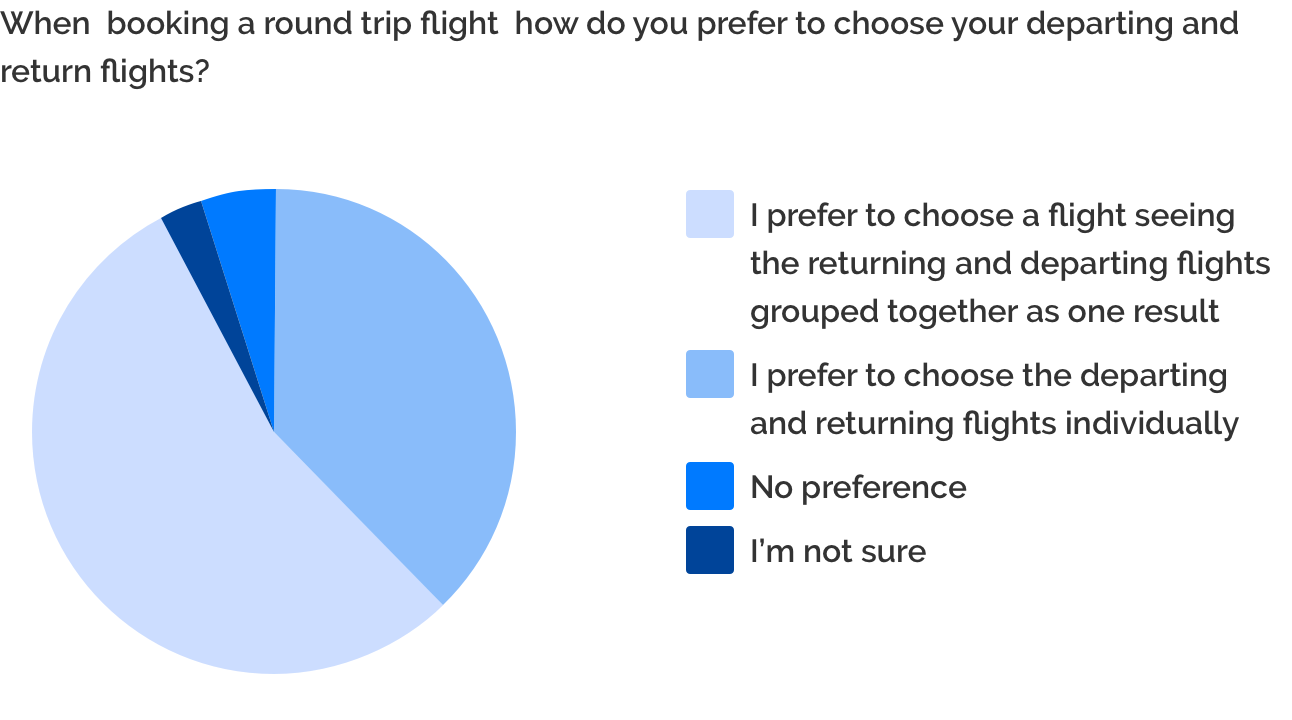
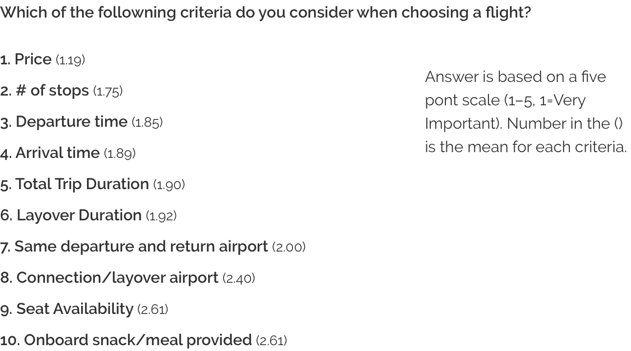
Using the below data, we decided to combine the departure and return slices into one listing, rather than have the user select their departure and return flights separately. It was also helpful for understanding the hierarchy of information within the listings and details view.
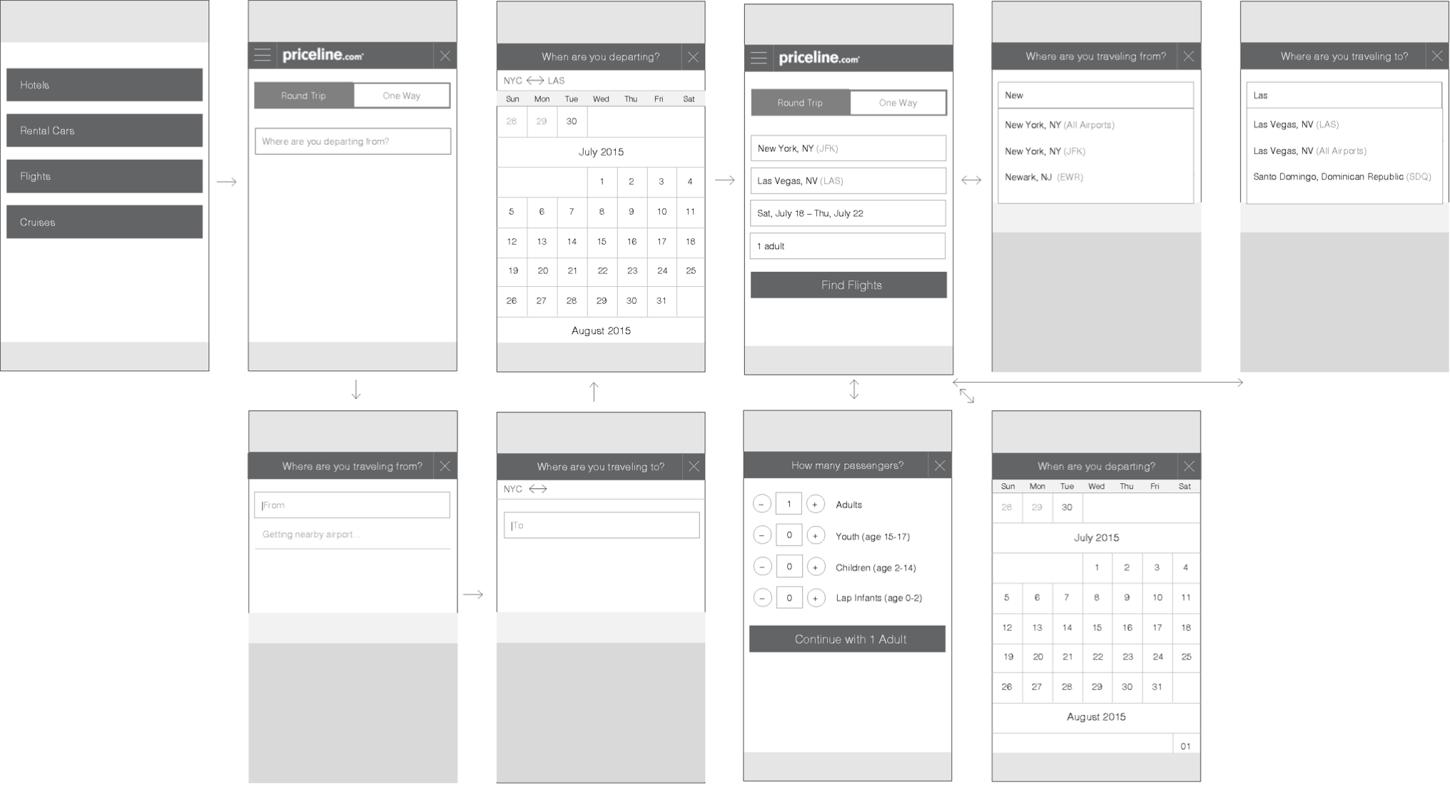
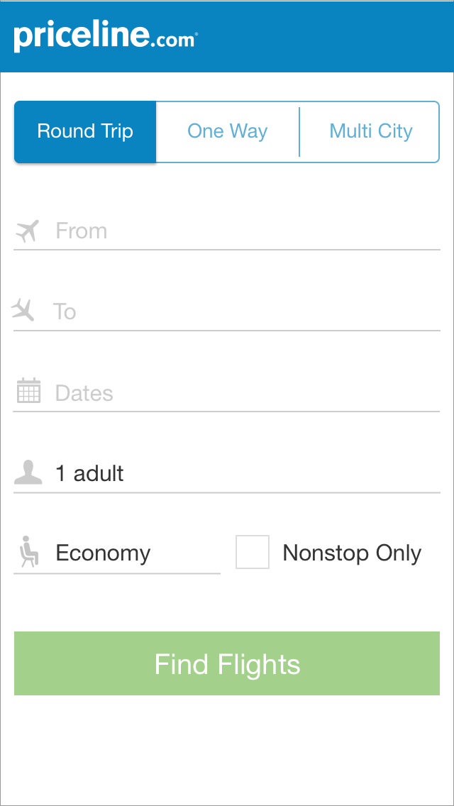
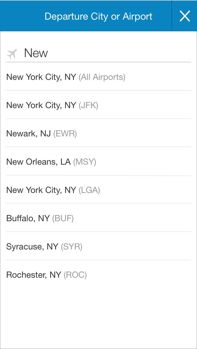
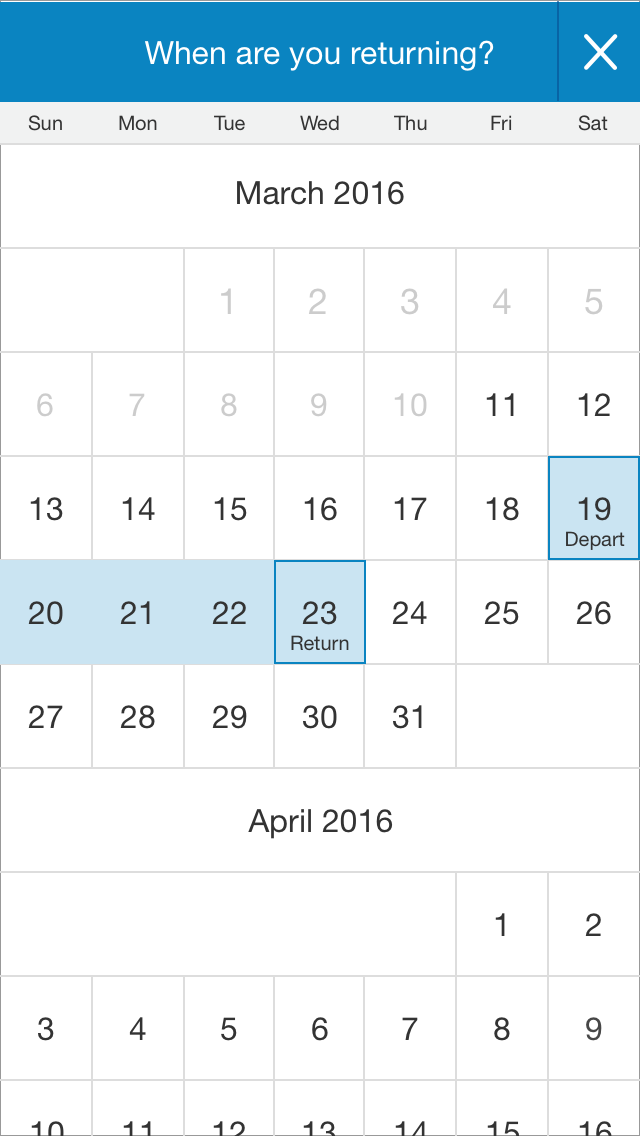
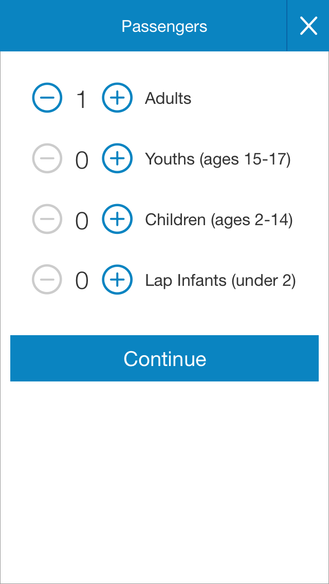
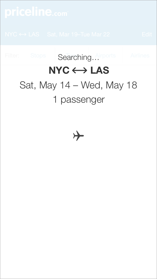
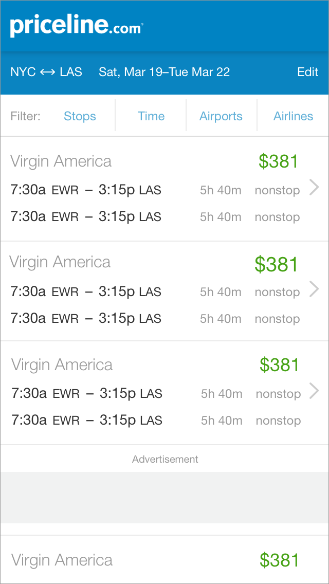
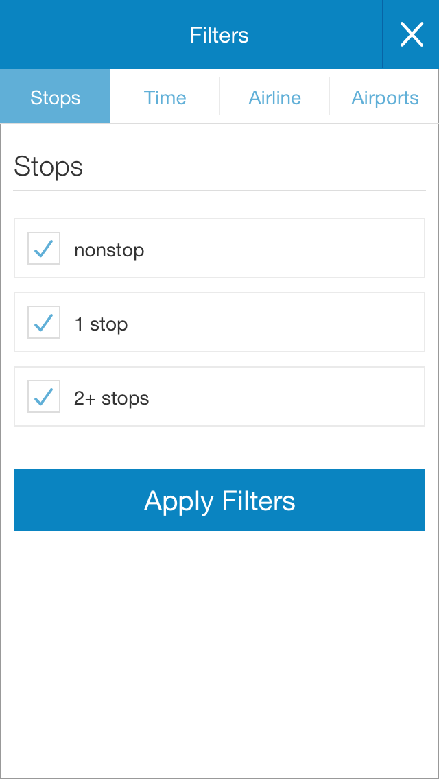
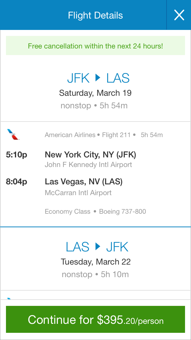
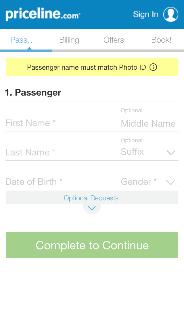
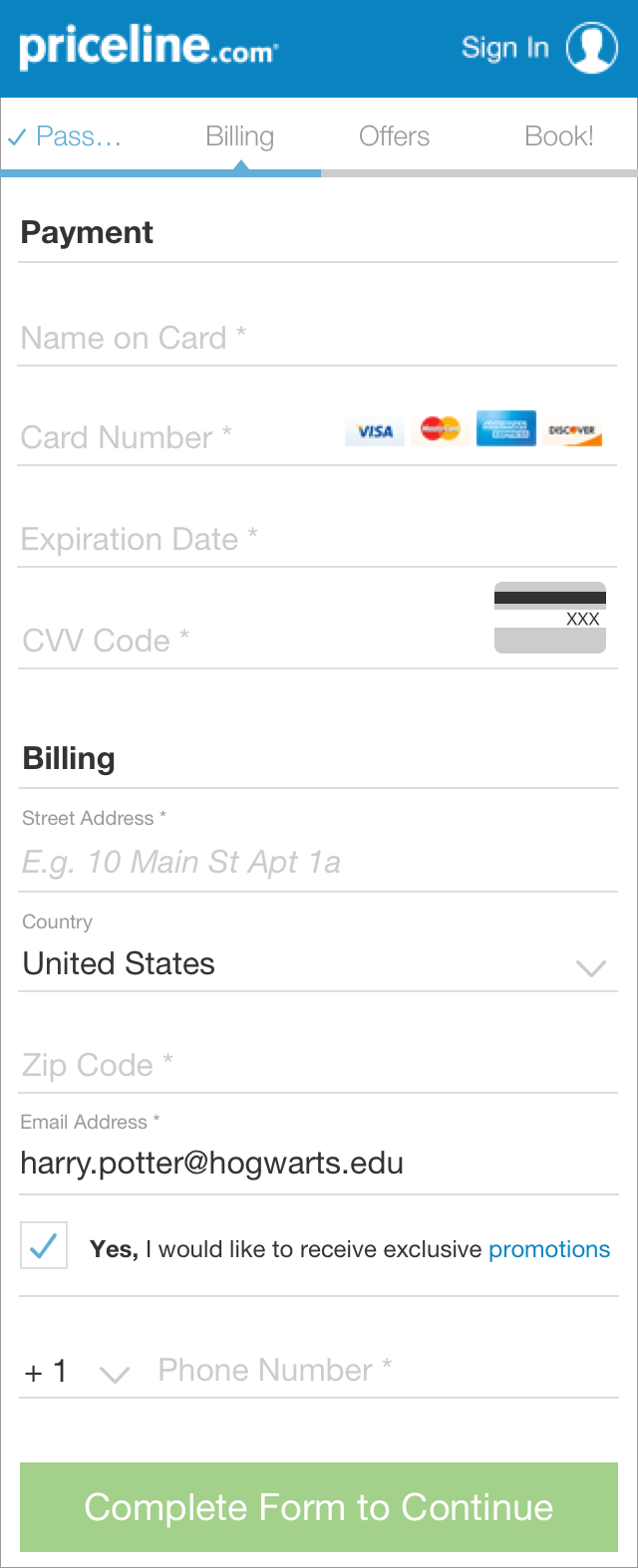
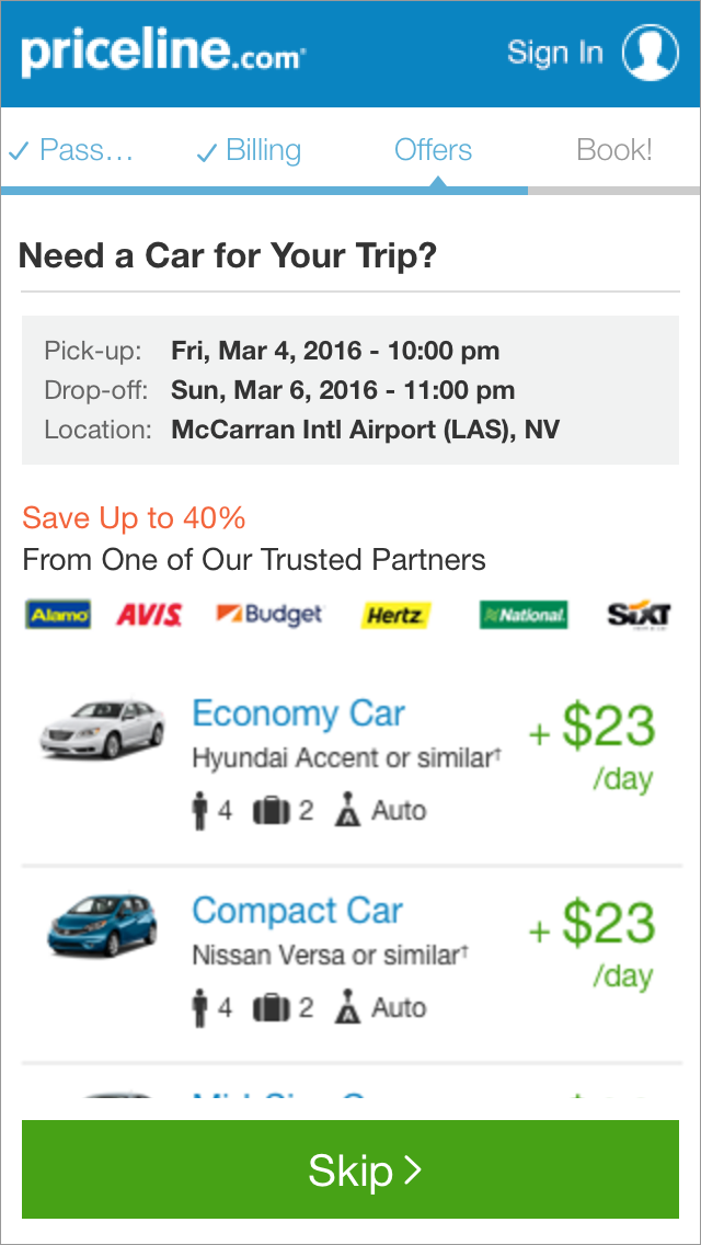
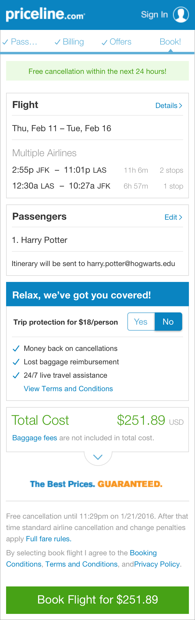
Below are some examples of final designs of the main flow including search, listings, and checkout.
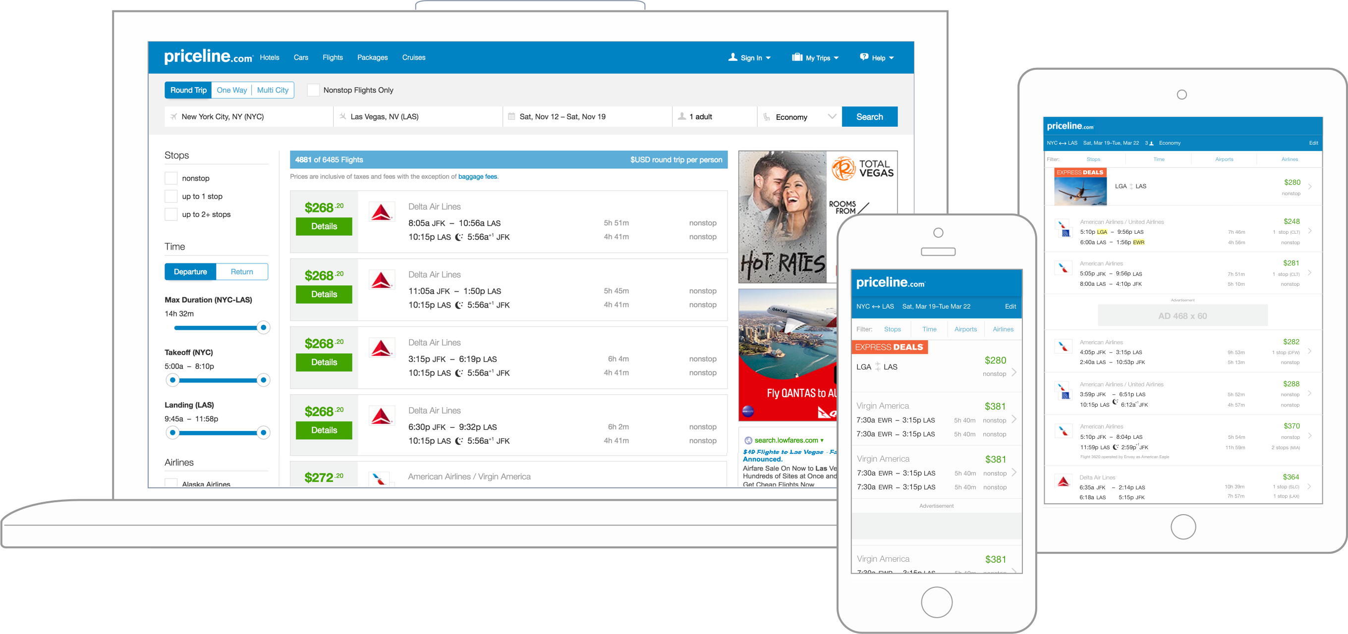
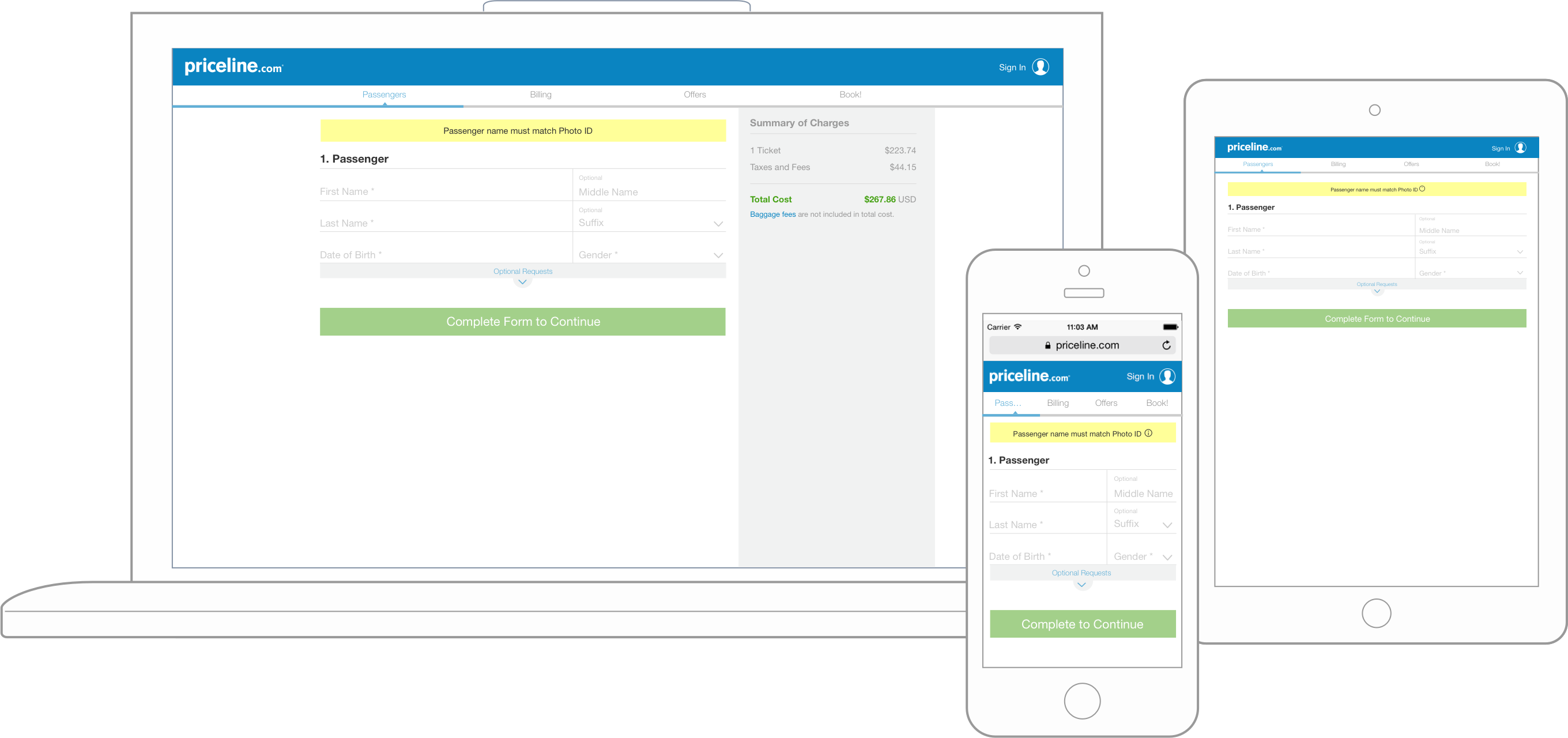
{04} Responsive
After the success of the new mobile web path we set our sites to the desktop experience. We utilized the great work done on mobile and built the experience up onto larger screens sizes. We did this first for checkout, entirely replacing the checkout flow and then built search and listings up through tablet. Because desktop listings was much more complicated, we took a slower, iterative testing approach opposed to replacing the entire design in one go.
{05} The Results
- Initial A/B test of pushing 10% of traffic to the new mobile web path saw a conversion increase of more than 13%.
- Responsive checkout experience had an approximate increase of 5% over the old desktop checkout.
- First responsive product path on Priceline.
- A successful foundation to build up from and add new features to that will provide a better experience for customers.