Your Priceline Trip

Background

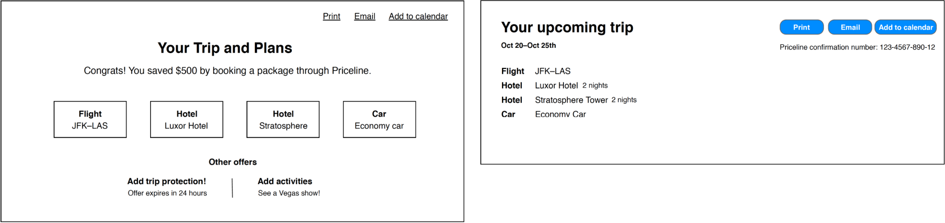
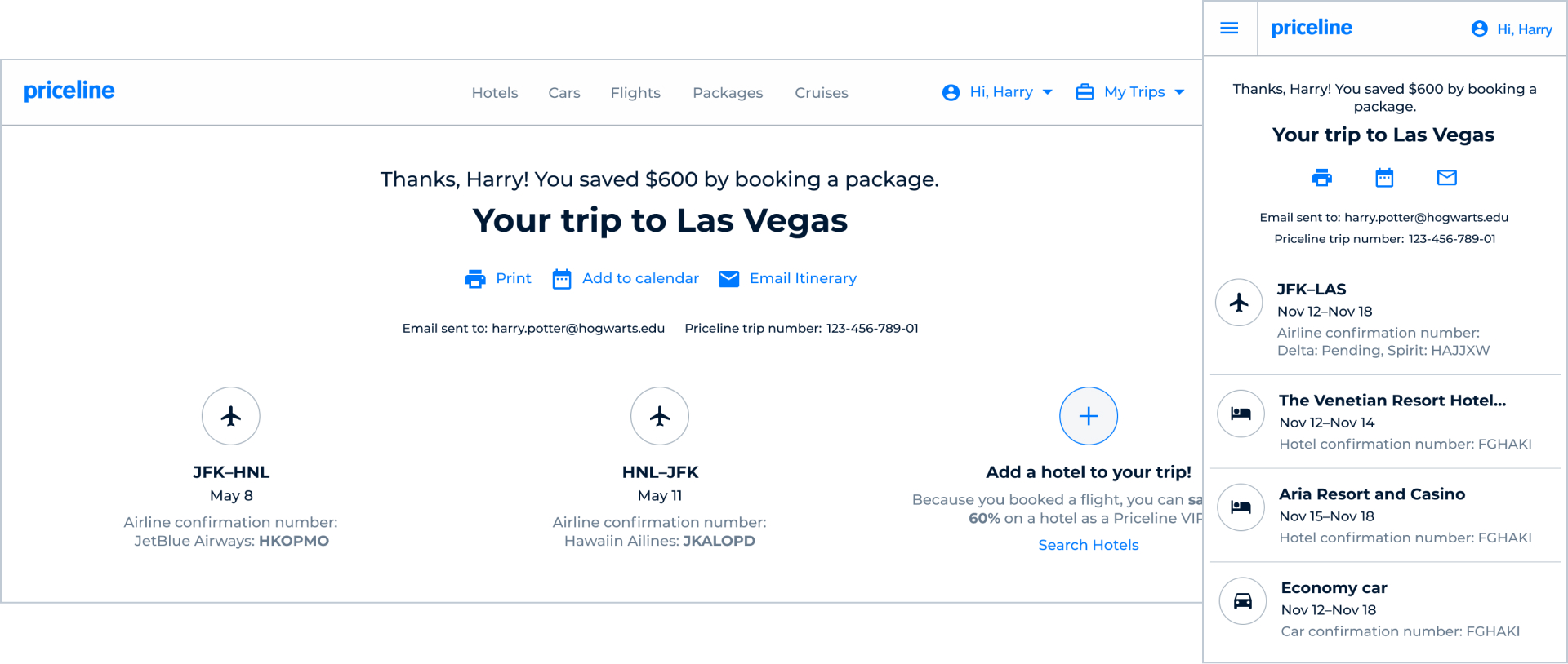
Priceline had replatformed most of its FE applications, but one application had yet to be replatformed and that was the order confirmation application. Originally, the order confirmation page had been designed as a single template used by each product, air, hotel, and car. But over the years they got further and further from that original single design.

Problem

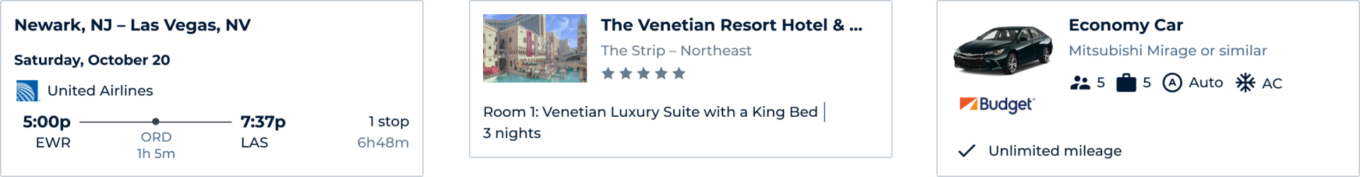
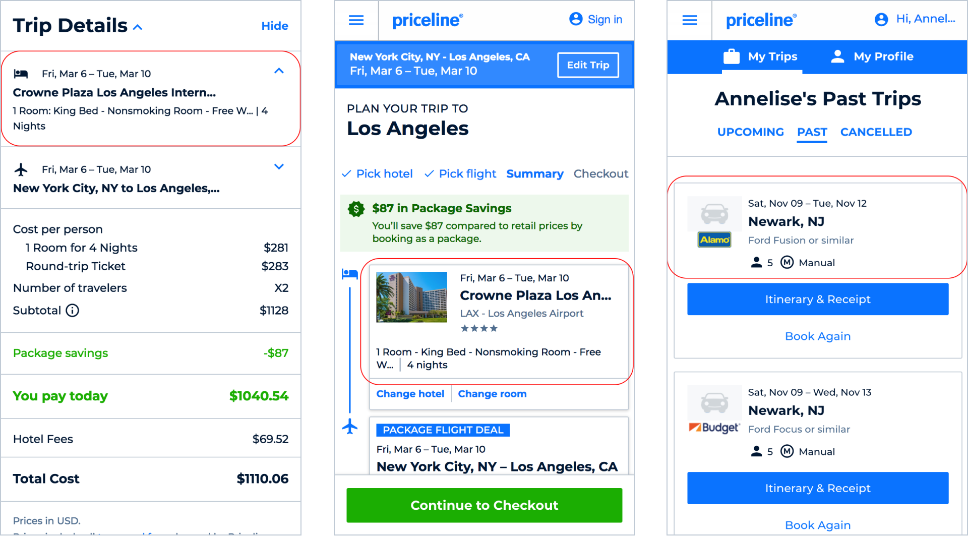
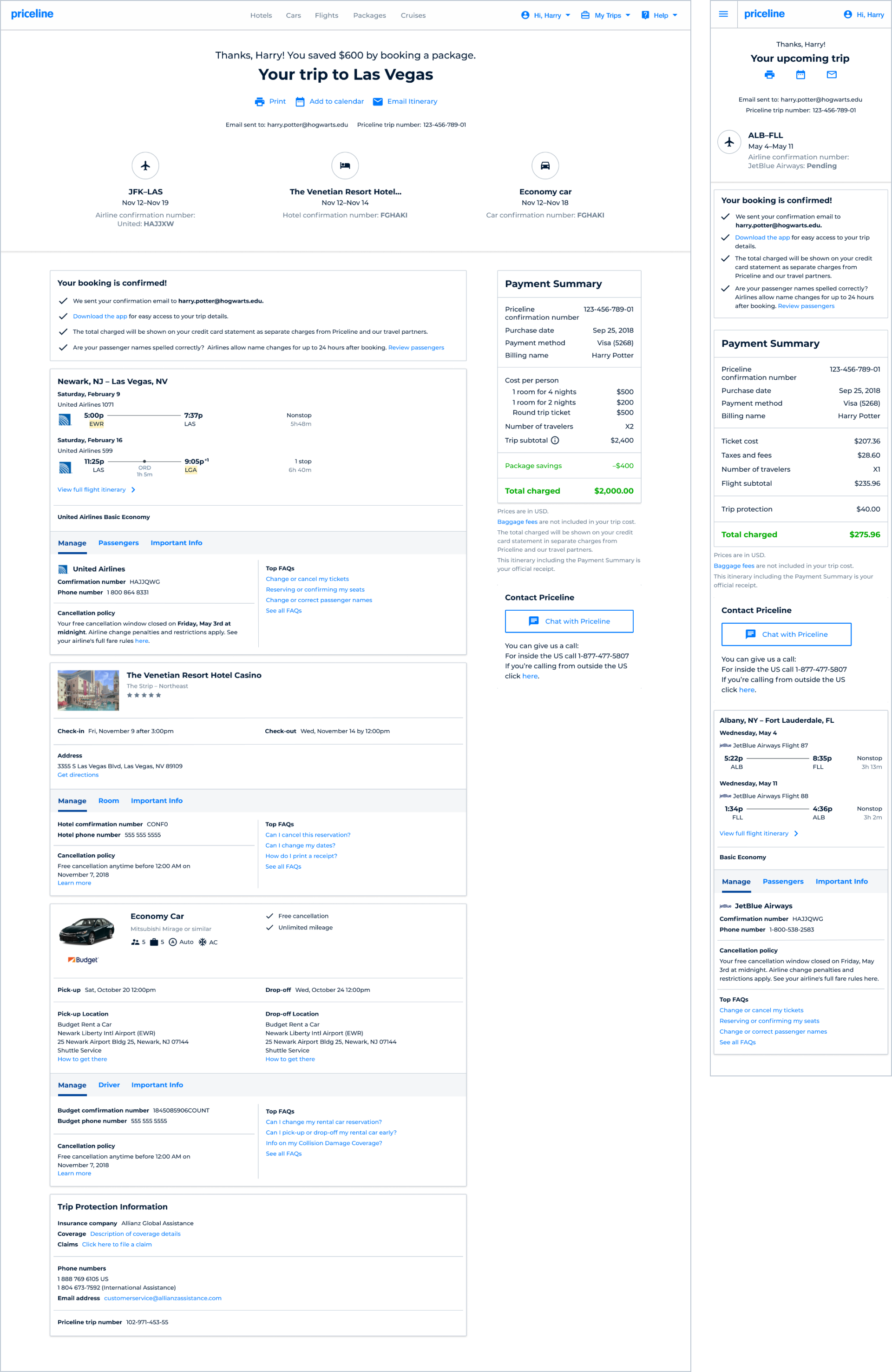
With a company initiative to grow the number of customers bundling products, Priceline was in need of an order confirmation experience that could take into account a customer booking a single product, or a customer booking 2+ products in the same order.

Goal

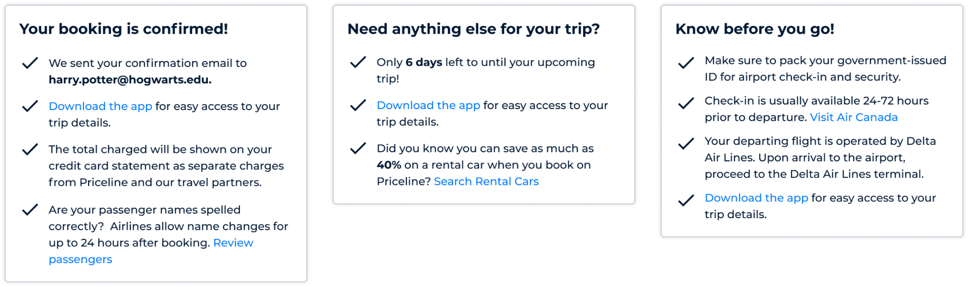
The goal was to provide the customer with a single, organized trip itinerary that helped them feel confident in their purchase and provided the necessary self-service tools should they require help. This would be done by building a single application of reusable common components in React, replacing the old angular pages

Team

My role was lead product designer. A junior designer worked with me during the first half of the project. The rest of the team consisted of a product manager and 4 FE developers. Our key partners were customer care, finance, and the product teams for the individual product verticals.

Supporting Data

What insights were there to gleam from how customers were interacting with the current confirmation page? When did they return to to it and what did they interact with the most? How did this differ by product or advance purchase window?

Top clicked FAQ pages

  • 1. Airline contact list
  • 2. Change or cancel hotel rooms
  • 3. Change or cancel airline tickets
  • 4. Multi airline tickets
  • 5. International phone numbers

% of customers who return to the confirmation page

  • Packages 83%
  • Air 78%
  • Rental Car 61%
  • Hotel 51%

Customer Journey

Priceline’s user researcher and I partnered up and led a workshop to define the customers post booking journey. The group created a 5 chapter story and then for each chapter delved into what the customers mindset may be.

This exercise also clarified scope. The first 3 chapters of the story we defined as in scope and the last 2 chapters in the story were moved to out of scope.

1. Post-Booking

Did the customers order go through and is it correct?

2. Plan

Have plans changed or can we help with further plans?

3. Pre-travel

What infrmation does the customer need?

4. Travel

Does the custome know their daily itinerary?

5. Post-travel

How was their trip and can we book their next trip?

Trip Overview

Design had a limited number of weeks to get started before deliverables needed to be ready for development. The junior design and I tackled the top of the post-booking page first, knowing we wanted to give the customer an overally summary of their trip, highlight thier savings, and make it easy for them to access more information.

Dynamic Content

During the customer journey workshop, the idea of providing the user with updated information depending on where they were in the journey was dscussed. This dynamic contnent component, aligns with the first three chapters of the customer’s journey: post-booking, planning, and pre-travel. The content would also update depending on which products a customer had booked.

Product Component

It was important to show the customer a summary of each of their product details they had just booked. By the time the customer gets to post-bookung, they had seen product details presented to them in numerous ways. One of the goals of this product component was for it to be utilized throughout the experience so the product information is presented to the customer in a familiar, similar way.

Cancellation Flow

Self-service cancellation, where available, is an important part of the customer experience. Product and design partnered closely with finance and customer care to learn more about chargebacks, the reasons customer’s cancel, and the how refunds work.

Full Design

The final design encorporated all of the above components/features with an emphasis around information in the right context. The design was dynamic, accounting for a customer booking 1 product or multiple products. The summary at the top of the page acted as hyplinks to the relevant product info lower down. FAQs and cancellation were moved into product summary cards rather than being on their own which was how they were designed in the old experience.

Results

  1. A single application in react that replaced the need to support and update 4 different confirmation pages.
  2. Specific FAQ pages highlighted on the confirmation page saw an increase of up to 76% in pageviews.
  3. Customer care contact rates for certain reason codes dropped up to 65%.

Reflection

During the research and ideation phase of this project, I was still lead designer for the flights team. A challenge of this project was juggling design for multiple teams at once. A positive was being on multiple teams meant having a background in key product requirements and regulations..

I would have liked to have had more up front time for research and more time to think through the architecture of a full post-booking experience, rather than focus mainly on the confirmation page.

One of the goals was to build a strong, flexible base, knowing we may need to pivot or grow experience in the future, which the team successfully accomplished.