Airlines have struggled in the past to make a profit, but the last couple of years have seen a positive change in profitability. There have been many different drivers behind this, one of which is the sale of ancillaries. This project focused on how to include ancillaries, through branded fares, on Priceline.com.
{01} The background
So what are ancillaries and branded fares? Ancillaries are the extras such as, seat choice, checked bags, wifi, etc. that the airline’s may charge you for outside of the base ticket price. Branded fares are when airlines group a bunch of ancillaries together into a fare. The higher the fare, the more ancillaries are included in your ticket.
Why do the airlines do this? Historically, whenever airlines have done things to try to improve the flight experience, like increase legroom, they must increase the cost of the tickets to offset what they're giving the customer. But, while many consumer's want a great flight experience, not everyone wants to pay extra for it. On average worldwide, airlines only make a revenue of $6/passenger because costs are so high (fuel). So, by charging for ancillaries, airlines can keep base price down. Then, if customers really want the extras, they can pay more for it, but customer's needs are met who are looking for that inital low price.
{02} Incorporating into Priceline
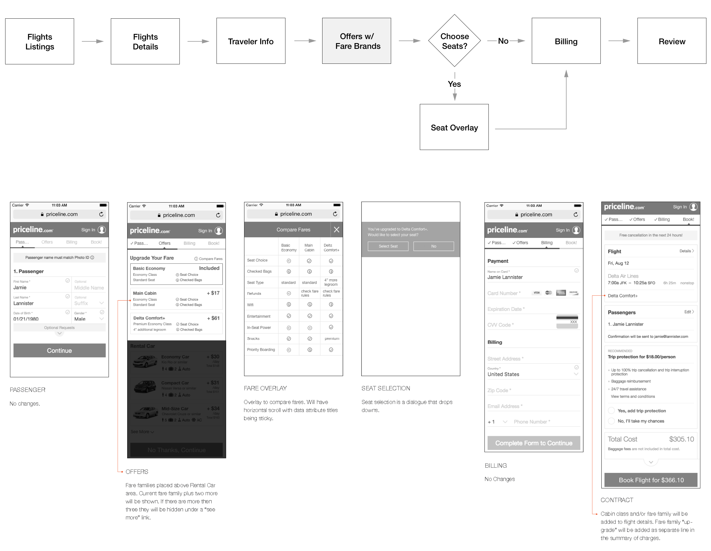
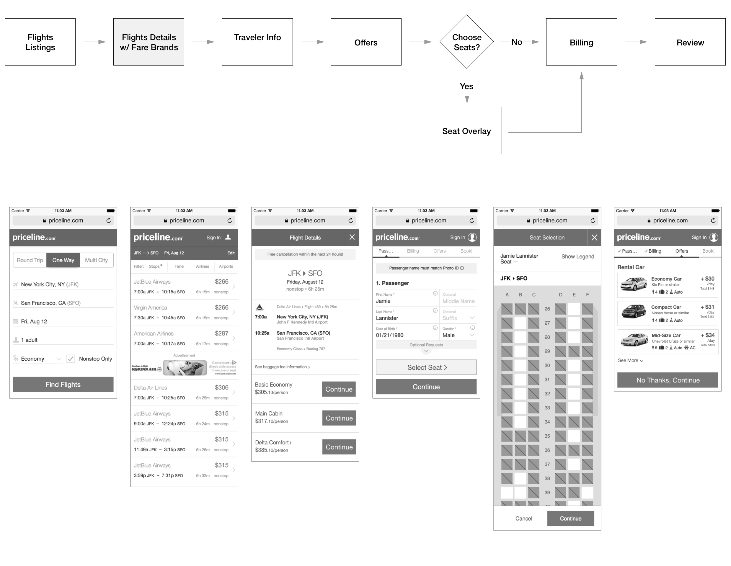
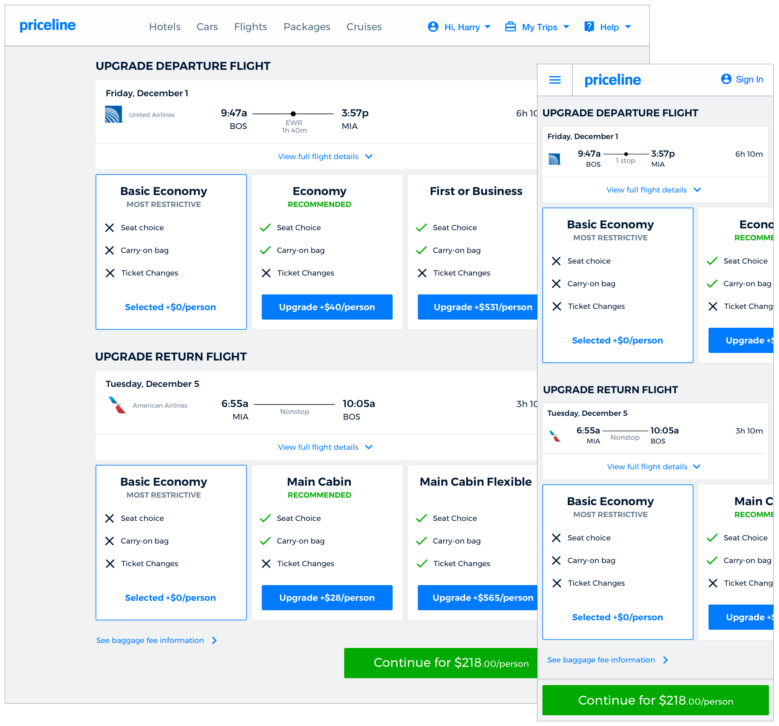
We first worked with Delta Air Lines, American Airlines, and United Airlines to include their basic economy fare within the flights tickets offered on Priceline.com, and the ability to upgrade to higher, more expensive fares. Although, I knew after talking with development, that we would have to add fare brands into checkout because of where the price confirmation occurred, I prototyped and tested two different user flows. One, showed the fare brand options within the checkout steps. The second, asked users to select a fare brand earlier in the path within the flight details section before checkout. I was able to learn that what the user preferred directly correlated with 1) does the user have a family and 2) income. People who travel alone and have a lower income preferred to see the options in checkout, where they could easily skip over the upgrades, as it is something most wouldn’t consider. People with a higher income and families preferred to see fare brand options upfront so they didn’t waste their time getting through checkout with a flight that didn’t have the ancillary options they wanted.
{03} Design and complexity
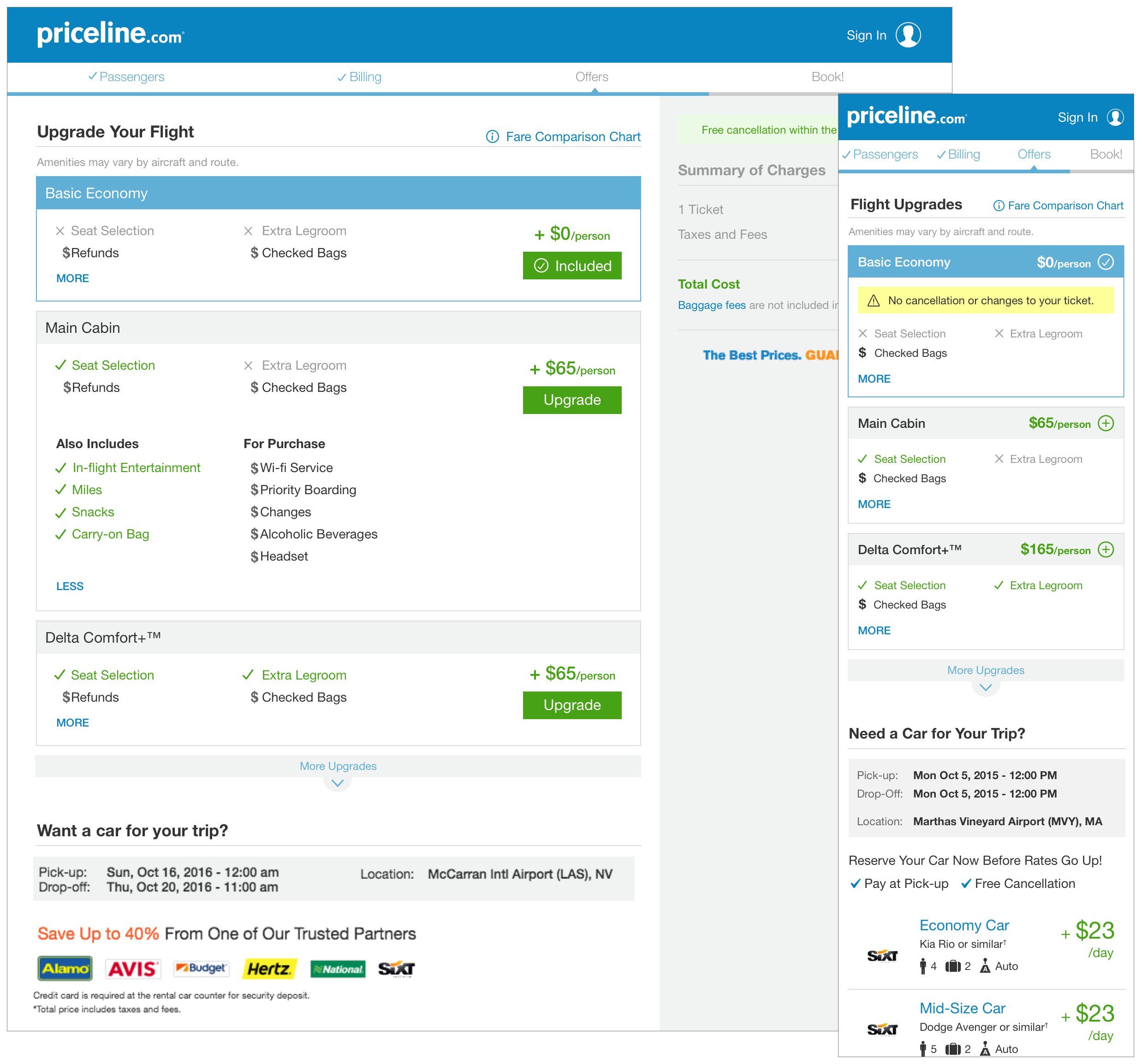
One of the complexities with this project was that every airline handles branded fares in a slightly different way and each of our partners had a few special requests. What information we were able to include on each fare was also dictated by the GDS (Global Distribution System) we pull the fare information from. With that said, my goal was to present the information in a clear way that allowed easy comparison and could be scaled ofor an infinite number of airlines.
{04} Results
The intial launch of basic economy fares within listings saw a ~1.7% increase in conversion. Approximately 6 months after launching fare brands on Delta Air Lines, we learned that out of all the customers who book premium economy cabin tickets (Delta Comfort+) 65% of them were upgrading through fare brands in checkout, and 35% were from searching premium economy on the hp. Most of the flight searches are for the economy cabin class, so selling upgraded fares through checkout (and later post booking) is a big win.
{05} Reworking the user flow
After a year of first introducing branded fares on the site, we made the decision to move fare brand options up to the flight details page (which was the other flow mentioned in step 2). This decision was largely influenced by a universal checkout initiative going on at the time, but could also be a benefit to the customer so they aren't hit with any surprises in checkout.
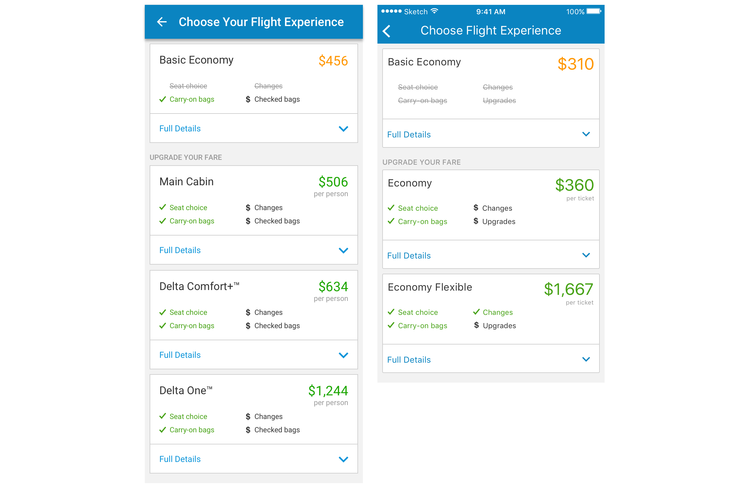
{06} Native iOS and Android apps
To get the best deals on the native apps, the iOS and Andriod teams added Basic Econonmy flight and fare brands to their flights paths. I completed the design, matching the design of their path and worked with the flights PM, apps PM, and apps developers for both iOS ans Android to get this new experience out. The Android team saw a ~7.5 conversion gain from this A/B test.